Using digital print media on walls and floors can quickly and cheaply transform a space, but success depends on how well the design suits your environment. A layout that looks strong on screen does not necessarily always perform the same way once it is installed and viewed in real conditions. In this article, we explore a few design principles to make sure your graphics remain clear, readable and effective once they are in place.

Rule #1: Treat walls and floors as architecture, not paper
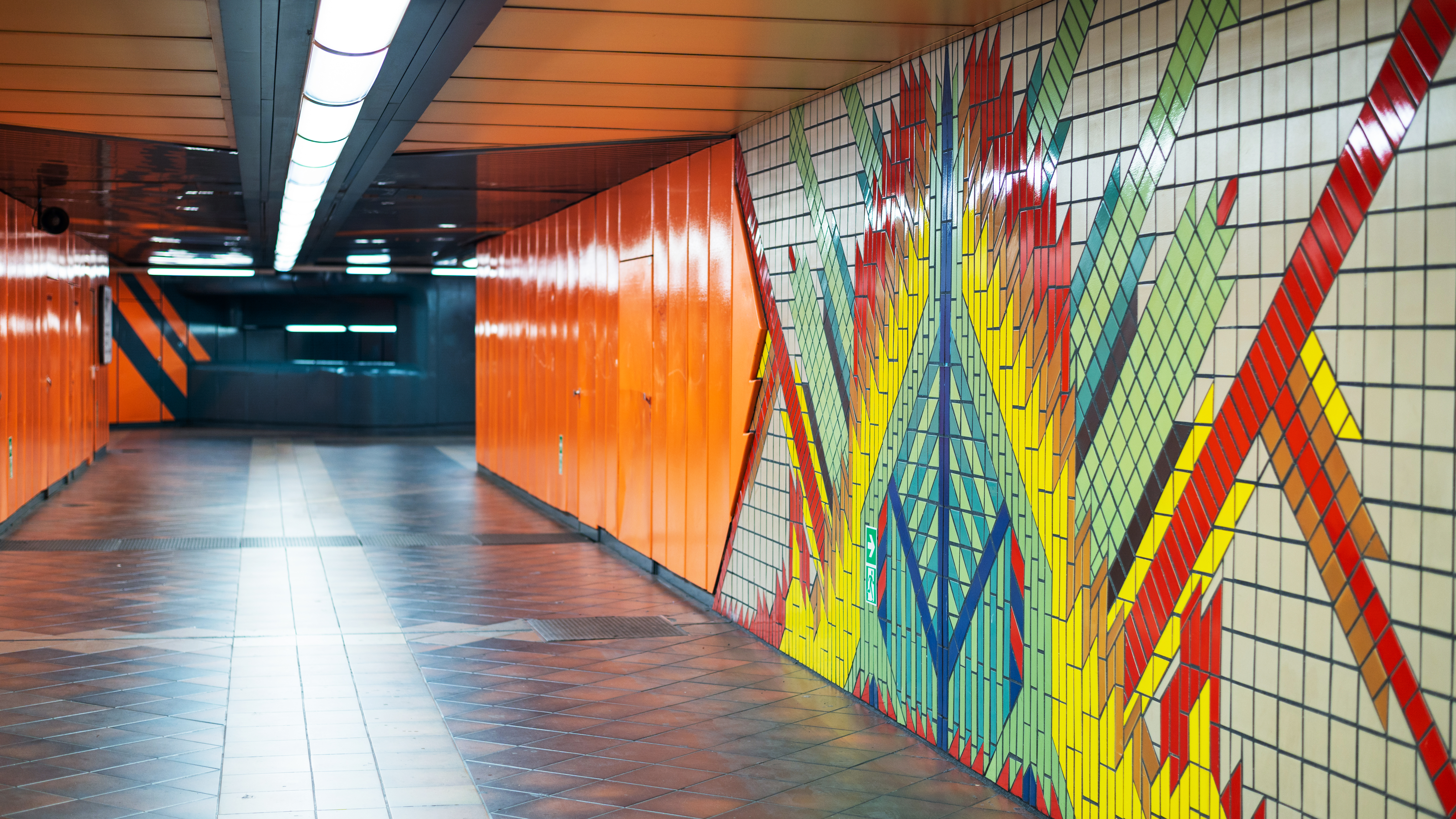
The biggest blunder in digital print media is designing as if every surface behaves like a flat canvas. They don’t. Even relatively flat walls and floors are part of the building; they interact with light, movement, furniture and people, so should be treated more as architectural features for print purposes, rather than a substrate. Wall graphics, especially, should complement the structure they sit on. Door frames, corners, sockets and joins all affect how the design is read. Floor graphics must work around access routes, sightlines and safety markings, and so on. Essentially, your design should respond to and work with the space, not fight it.
Rule #2: Design for angles rather than head on viewing
Very few people view wall and floor graphics straight on. Walls are often seen at an angle as people walk past, and floors are viewed from above and at speed. This makes perspective an extremely important part of wall graphic or floor graphic design. Text needs extra spacing to be clear, shapes need more sharply defined edges, subtle effects that rely on straight viewing often disappear. Successful large format printing accounts for the distortion caused by angle and distance.
Rule #3: Use scale to control attention
Large surface graphics do not need large amounts of content to control a room. In fact, scale is most effective when it is used to simplify the content and messages presented. A single oversized word or image often communicates more clearly than multiple messages competing for attention. On floors especially, scale helps guide behaviour, with larger arrows, symbols or colour blocks being easier to follow than detailed instructions.
Rule #4: Let the materials do some of the work
Your choice of materials will influence how the graphic feels as matters the design itself. Matte finishes reduce glare on walls. Textured wall surfaces soften visual edges, and the floor material affects both contrast and colour strength. This means that the exact same artwork can feel completely different depending on the material it is printed on – a good point to remember when designing standard prints for multiple sites. Good digital print media design considers the subtle interplays between ink, surface and lighting in each space, adjusting the design to deliver the intended impact and impression.
Rule #5: Avoid designing everything to be “read”
Not every graphic needs to be intensely studied, nor even command the viewer’s full attention in order to get its message across. Some graphics are there simply to support atmosphere, or reinforce wayfinding or crowd control subconsciously. Background patterns, colour fields and repeated motifs work well on walls where detailed messaging could overwhelm the space. For floor graphics, visual cues often work better than words. People generally respond faster to symbols and movement cues than text.
Rule #6: Plan removal before installation
Temporary wall and floor graphics still need a clean exit, and generally speaking, graphics that respect the surface are easier to remove and leave the space ready for its next use. Designing with removal in mind affects your material choice, adhesive strength and layout. Unfortunately, this practical consideration often gets overlooked until it becomes a problem!
Find out more
When wall graphics and floor graphics are designed as part of the environment rather than applied decoration, they feel more intentional and effective. If you’d like to request a quote, simply click here.

Image Source: Canva
